Summary: Latitude vs. X

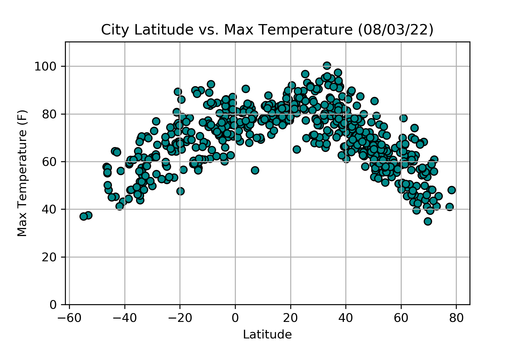
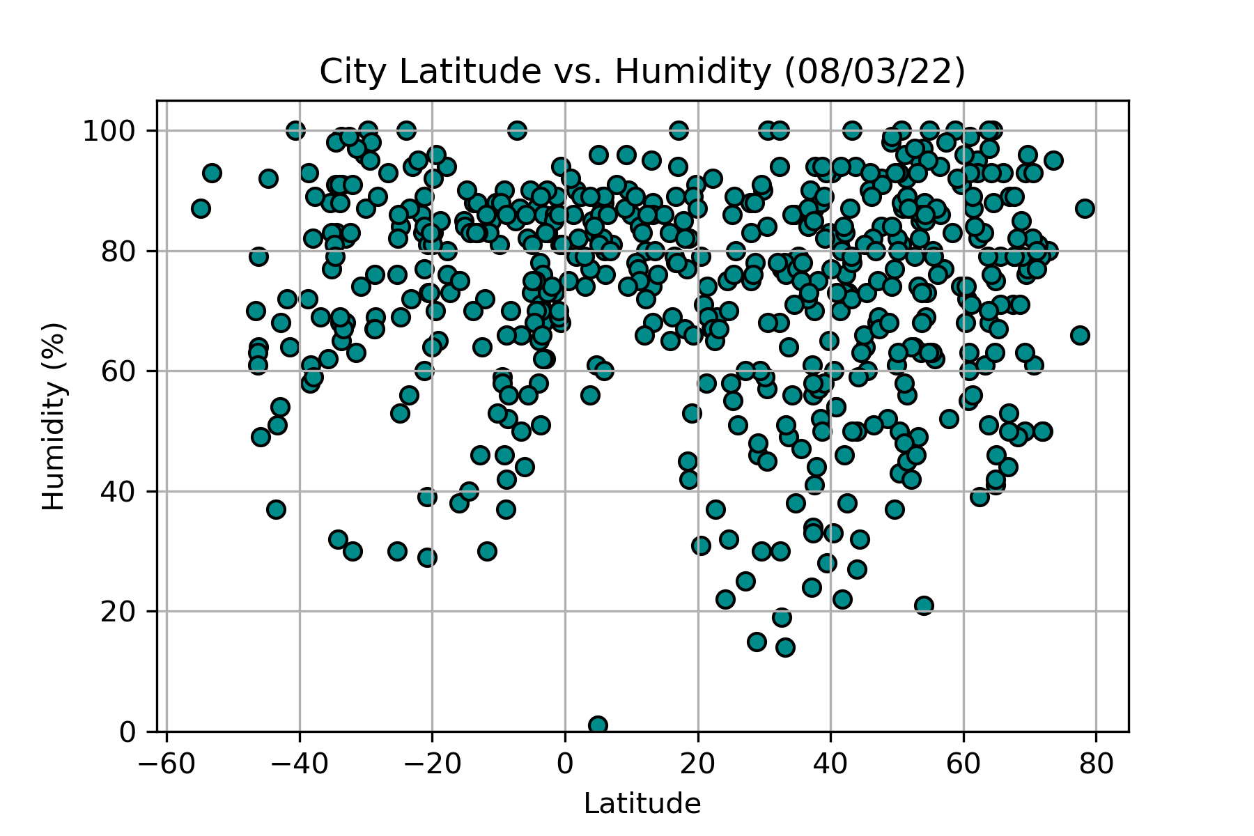
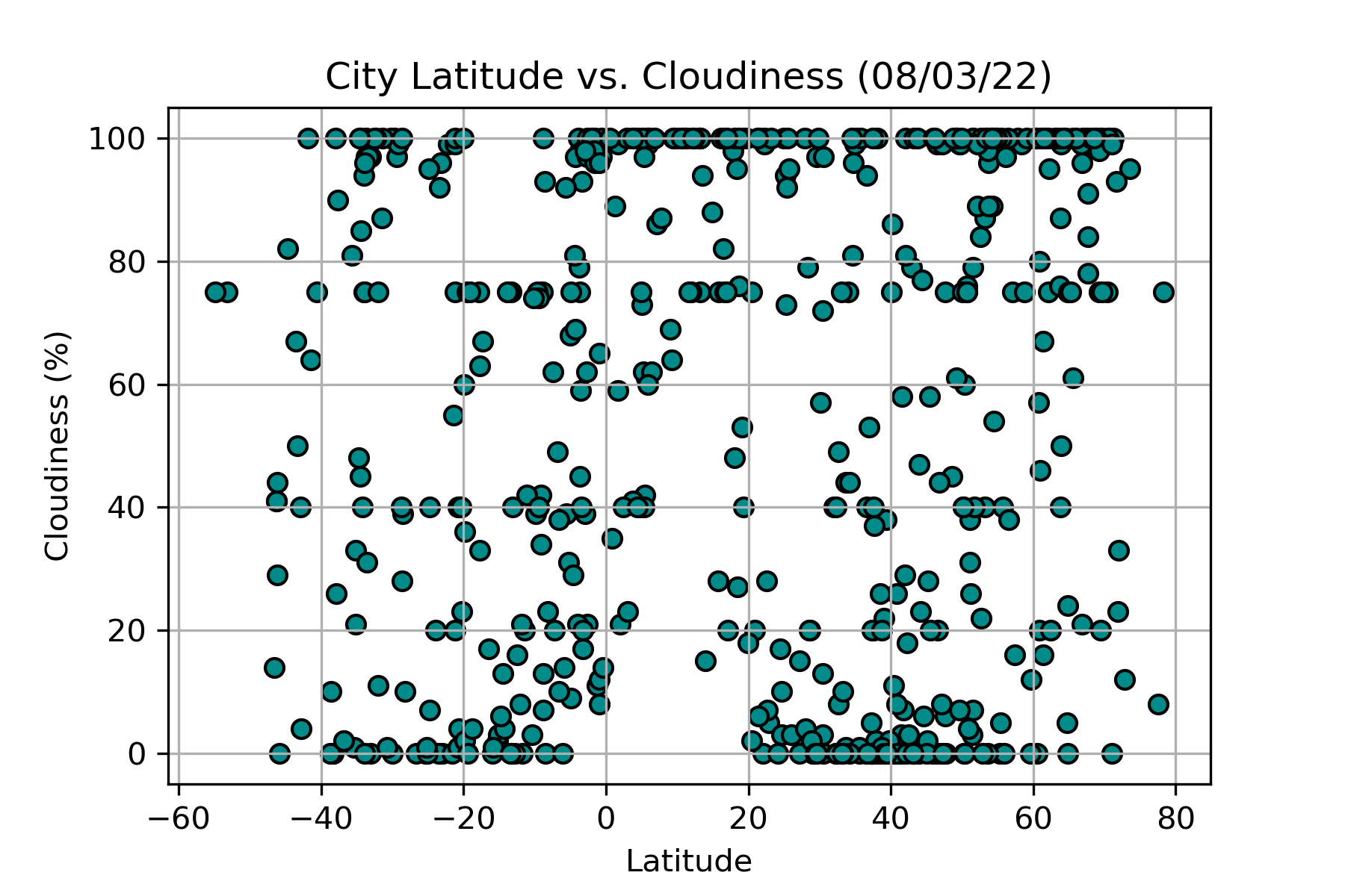
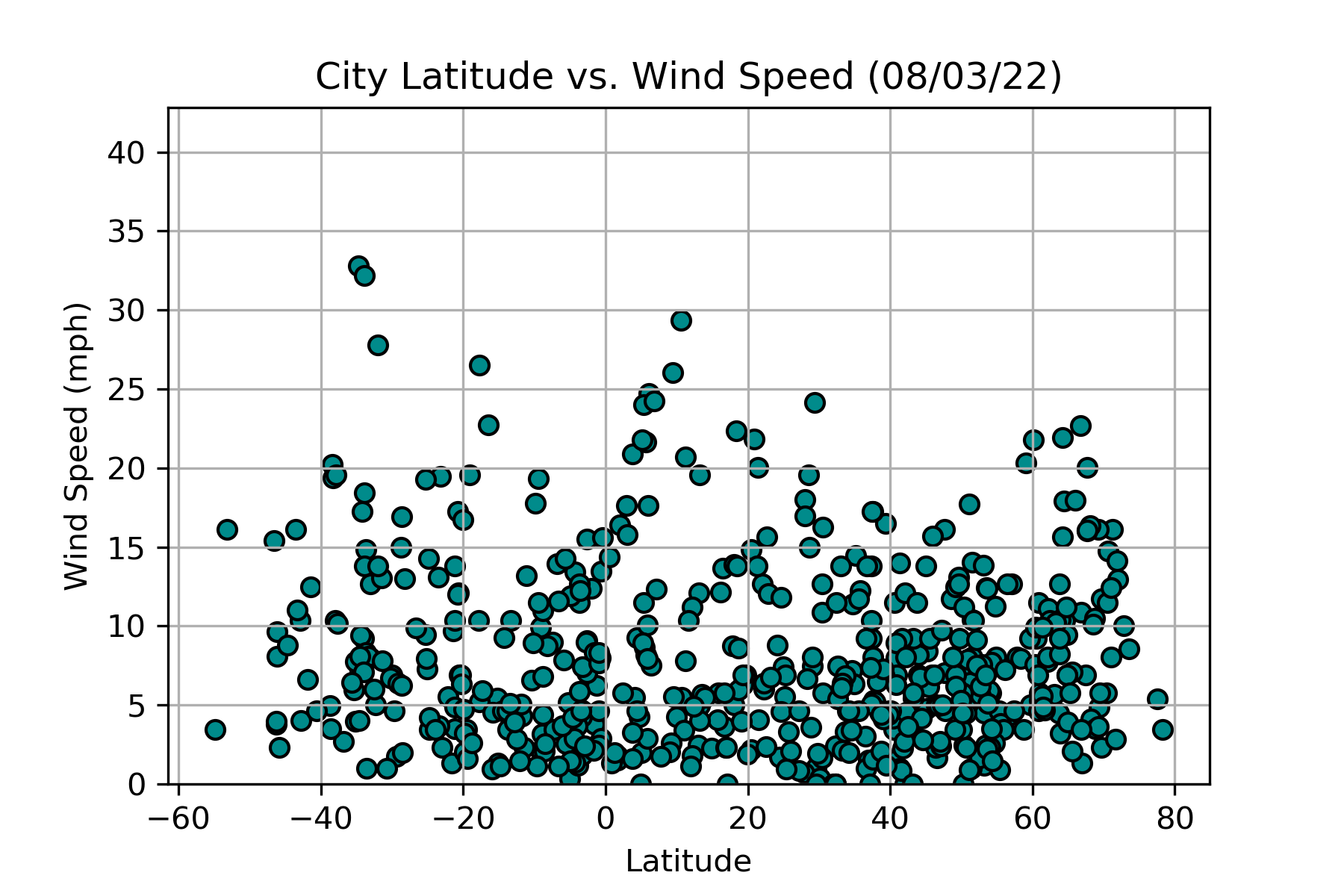
"What's the weather like as we approach the equator?"
Using a Python script, over 500 cities were randomly selected by latitude and longitude. After each city was selected, a weather check was completed using a series of successive API calls to the OpenWeatherMap API. The results were collected and stored in a data frame for further analysis.
After that, visual representations of the relationships between latitude and temperature, humidity, cloudiness and wind speed were created in the form of scatter plots using Matplotlib. This website includes the source data as well as analysis of the data documented by visualizations.


