Max Temperature

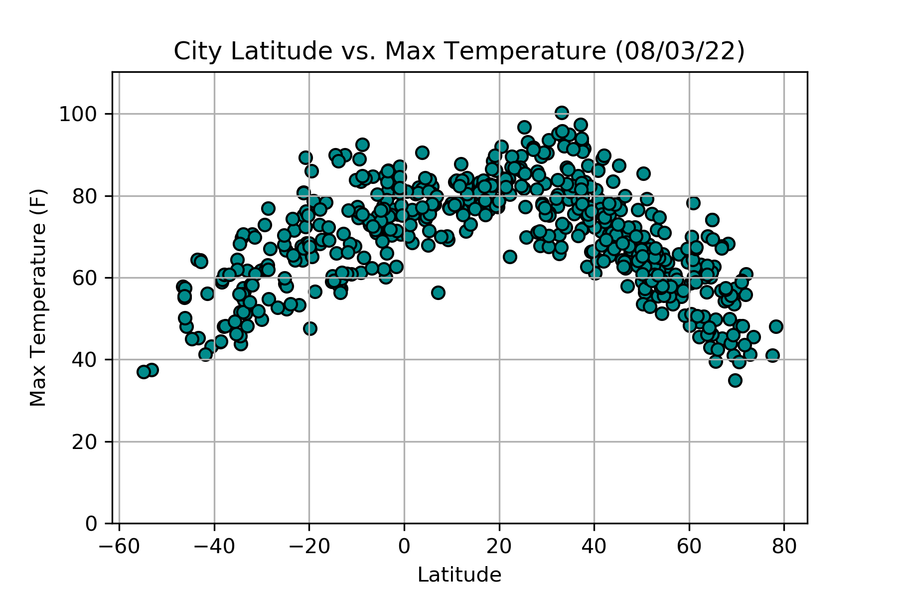
The above scatter plot displays the maximum temperature reached on the date of the API query and the corresponding latitude of the city. As the latitude approaches 0 (or the equator), the temperatures increase. The shape of the scatter plot appears to create a normal curve.


